brand guidelines
our brand. use it right.
logos, colors, typography, and usage guidelines. everything you need to represent maxiphy consistently across any medium.
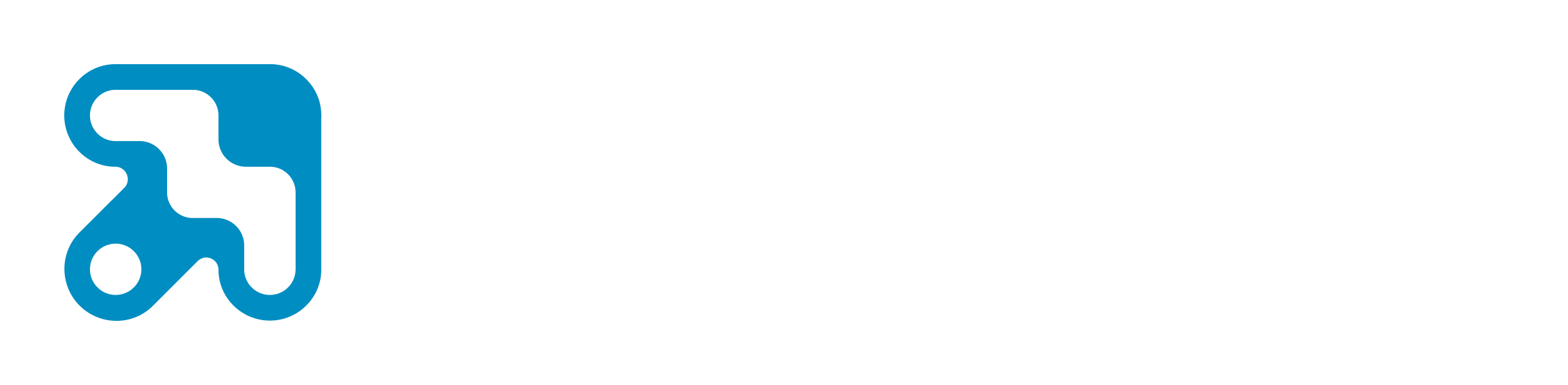
01 — logo
logo variants
three logo types for different contexts. toggle between dark/light, colored/monochrome, and english/arabic to preview.
02 — guidelines
logo guidelines
construction rules, the pipe pattern, and usage do's and don'ts.
construction
rules
- logomark is a square: 1u x 1u
- logomark height equals the wordmark font size
- gap between mark and wordmark is 0.5u
- letter cap-height aligns with mark top edge
- letter descenders align with mark bottom edge
- minimum safe area of 1u on all sides
the pipe pattern
"maxiphy" is always font-black. the pipe and section name are always font-light. exception: the legal name does not use a pipe.
do
- Use the colored-on-dark logo on dark backgrounds (preferred)
- Maintain clear space equal to the height of the mark on all sides
- Use SVG for web and digital, PNG for print and presentations
- Use monochrome white over photography or color
don't
- Recolor the logo mark
- Stretch, rotate, or distort the logo
- Add drop shadows, strokes, or gradients
- Place the light variant on dark backgrounds (or vice versa)
- Recreate the wordmark in a different typeface
03 — colors
color system
our palette is built for dark interfaces. every color has a defined role. tap the copy icon on any swatch to copy the hex.
Brand Hues
maxiphy Blue
#008DC1
Primary brand color — logo mark, links, accents, CTAs
Dev Green
#34C186
Development service accent
Marketing Yellow
#FFA216
Marketing service accent
UI/UX Red
#E01C4B
UI/UX sprint service accent
Branding Violet
#9636F6
Graphic design & branding service accent
Neutrals
Black
#000000
Page background, dark text on light surfaces
Grey 700
#4B5563
Borders, dividers, disabled states
Grey 600
#6B7280
Muted text, captions
Grey 400
#D1D5DB
Secondary text
White
#FFFFFF
Headings, body text, backgrounds
04 — typography
type system
Urbanist is our sole typeface for Latin scripts. Noto Kufi Arabic is paired with it for Arabic content. five weights for both: 300, 400, 500, 700, 900.
Latin typeface
Urbanist
Aa Bb Cc Dd Ee Ff Gg Hh Ii Jj Kk Ll Mm Nn Oo Pp Qq Rr Ss Tt Uu Vv Ww Xx Yy Zz
0 1 2 3 4 5 6 7 8 9 ! @ # $ % & * ( ) + = ? / . , ;
get Urbanist on Google FontsArabic typeface
Noto Kufi Arabic
ا ب ت ث ج ح خ د ذ ر ز س ش ص ض ط ظ ع غ ف ق ك ل م ن ه و ي
٠ ١ ٢ ٣ ٤ ٥ ٦ ٧ ٨ ٩ ! ؟ . ، ؛
get Noto Kufi Arabic on Google Fontstype scale
maxiphy
products we built
our approach
the design system
discovery week
every project starts with a real problem.
we design products that work before writing a single line of code.
case study, 6 min read, Beirut, Lebanon
WRITTEN BY
branding sprint
want a brand this intentional?
every color, every weight, every spacing rule on this page was designed in a 15-day branding sprint. we can do the same for your company. logo, color system, typography, and a full brand guidelines document, ready to use.
explore the branding sprint